Introducing Green into the Kitchen with Little Greene
Green paint is reassuring, soothing and elegant, ideal for areas that require tranquillity, a fresh-feeling colour that symbolises growth and renewal when making that perfect tasty dish. There are lots of colours across the palette perfect for a restful scheme, a bold and energetic room, or cosy and warm living spaces. It's a versatile hue that suits a range of tastes, making it a modern choice in the home today. When used correctly it can be an ideal shade for the kitchen. Below we take a look at some of the green hues from Little Greene’s palette and a few of our projects that have been hand-painted in some of these stunning greens.
Little Greene Green Paint Colours at a Glance
Little Greene's greens fall into five broad families: muted greens (Kitchen Green, Normandy Grey, Sage Green), pale greens (Mirror, Hidey Hole, Tabernacle), warm greens with a touch of yellow (Boxington, Jewel Beetle, Olive Colour), blue-greens or aquas (Canton, Tea with Florence, Harley Green), and strong greens (Hopper, Puck, Obsidian Green). Because our kitchens are hand-painted, any of them can be applied to your cabinetry, from a soft muted backdrop to a dramatic statement island.
Muted Greens
Since the beginning of interior decoration, muted greens have been used. Muted colours such as Sage Green, Livid and Pleat in an all-over colour scheme make a fabulous backdrop when hanging artwork, allowing them to combine well with both contemporary and classical works. These muted green paints are stunning with gold frames and ideal in places of relaxation.
A popular hue that hints at the orchard and eases the transition from the inside to the garden.

A timeless grey stone with undisputed elegance and personality.

This colour was enjoyed by the Victorians “on account of their response to the sight, and their solid and quiet tone”.

Pale Greens
Bring gardens and parks indoors with a pale green. The natural feeling and light that comes from this shade allow us to feel pleasure on so many levels. The lemony hints found in some bring freshness to a green paint scheme, whilst greens with a blueish influence like Tabernacle provide a clearer interpretation. These colours are all suitable for kitchens and quiet spaces, pairing well with strong greens and many neutrals.
A pared-down green with unquestionable calming quality.

Secluded amongst trees on the grounds of George Bernard Shaw’s Hertfordshire residence is a small hut where Shaw found the tranquillity he needed to write. This small space was surrounded by this peaceful pale green.

This green hue was painted on the small wooden pavilion in Winston Churchill’s home to match the garden furniture.

Warm Greens with a Touch of Yellow
Bright green paint colours bring energy to any scheme. Good use of a strong bright green, such as Olive Colour, can be applied very successfully as an all-over colour for both woodwork and walls.
A reduced lime with added red oxide of iron provides a relaxing and elegant backdrop wherever situated.

The Shakespearean actress Ellen Terry wore a spectacular green dress, crocheted to look like chainmail, embroidered with gold and decorated with a thousand iridescent wings from the green jewel beetle, which shed their colourful wings naturally.

A fashionable colour despite its price tag. Mrs Delany, the 18th-century writer, records having her English room painted in an olive colour for her pictures.

Our lovely client in Elsenham didn't want the usual grey or blue for her handmade kitchen so chose a combination of green and greige. Olive Colour was opted for on the island to make a statement feature within the kitchen design and match our client's design flair. We think it works wonders in this beautiful open-plan space!
Blue Greens
They are normally termed "aqua", representing an important suite of colours for interior designers. The aqua tones are respected both for their inherent beauty and their ability to combine very well with other colours, particularly with natural materials such as wood. Tea with Florence is a sophisticated darker shade which, along with Aquamarine Deep and Canton, has the strength to be the lead colour in a scheme. Use them with a paler choice to provide contrast and structure.
Inspired by Chinese rugs, ceramics and textiles from the Canton area. This colour would be perfect in south-facing rooms with off-white and a pale blue-green.

The Chinese Room in Claydon House, Buckinghamshire is widely considered to be the finest surviving example of Chinoiserie in Britain. This room was dedicated to a private sitting room and for making tea with visitors, including Florence Nightingale.

Harley Green is a strong green paint colour full of rich history. The library in Wimpole Hall is painted in this deep green-blue.

To complement the stainless steel appliances from Sub-Zero & Wolf are the deep greeny blues of Harley Green on the island and base cabinets.
Strong Greens
Strong greens retain their signature of natural heritage and create elegance and power wherever they are used. The rich colours found within these green hues will provide a superb backdrop alongside artwork and fabrics.
A bold green that is highly admired for the way it matches the colour of the leaves in the garden when the sun shines through them.

To bring an earthy appeal and a bold green to the kitchen design is Hopper. We hand-painted this onto the island in this delightful country home.
A strong shade of green: the name was famously used in Shakespeare's work "A Midsummer Night's Dream". Consistently mischievous but inherently a lonely character, this green paint colour creates a striking all-over scheme.

A classic off-black colour and popular for front doors and exterior railings, but in the 1970s it provided a dramatic backdrop to natural wood furnishings and khaki.

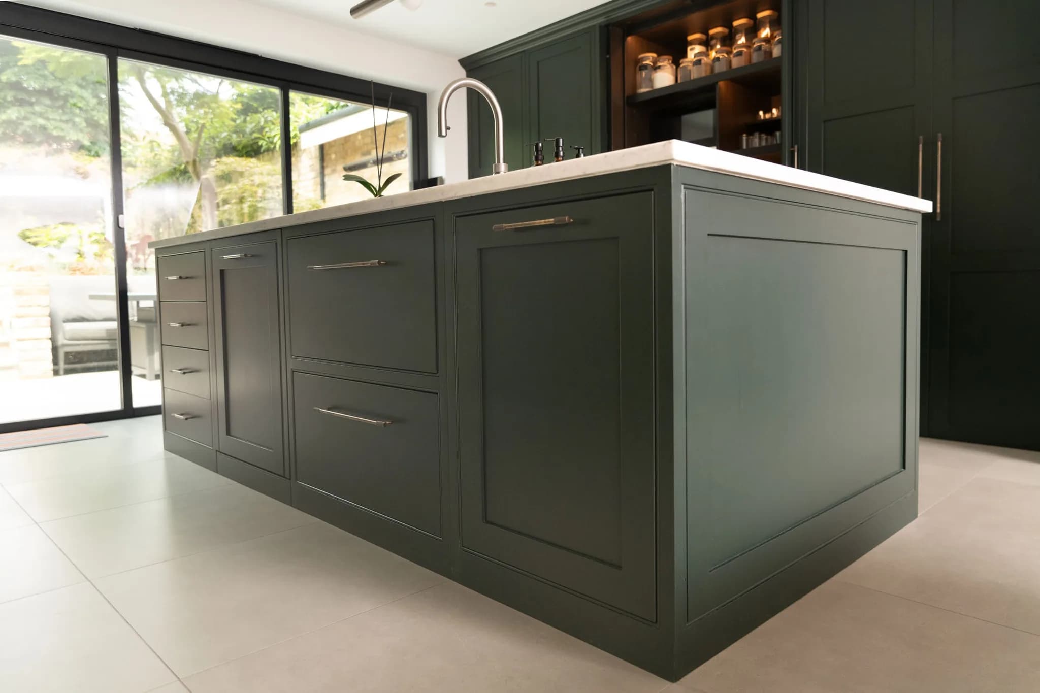
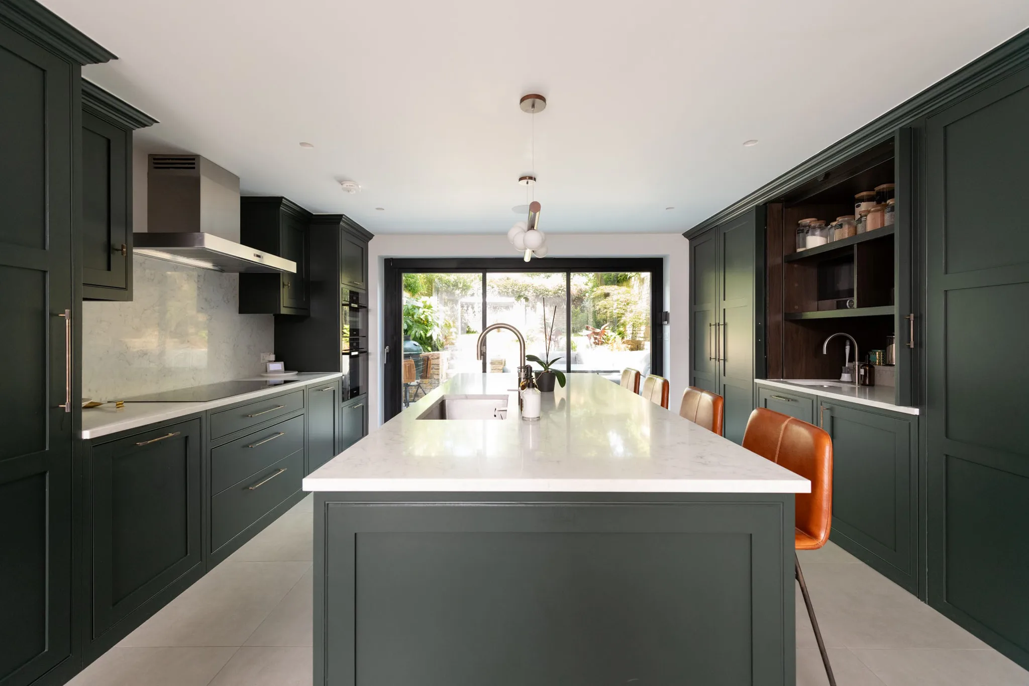
Walnut and Obsidian Green is what you find in this Victorian property. A space that envelops you in a dramatic yet inviting atmosphere.
Little Greene Green Paint FAQs
What are the most popular Little Greene greens for kitchens?
Sage Green and Olive Colour are perennial favourites for a warm, characterful kitchen, while Hopper and Obsidian Green make dramatic statement shades on an island. For a softer, calmer scheme, the muted and pale greens such as Kitchen Green, Mirror and Normandy Grey work beautifully.
What green goes well with natural wood and oak?
The blue-greens, or aquas, are particularly good with natural materials. Harley Green and Canton pair beautifully with oak and walnut, which is why we chose Harley Green alongside natural wood in our Ingatestone project and Obsidian Green with walnut in Islington.
Is a green kitchen a good idea?
Yes. Green is one of the most versatile colours for a kitchen: muted and pale greens create a calm, restful scheme, warm yellow-greens bring energy, and strong greens make a rich, elegant statement. The right shade depends on the light and the mood you want.
Has Little Greene discontinued any of these greens?
No. Little Greene never discontinues a colour, so all of these greens remain available, and any shade removed from the current card can still be ordered from their Archive.
Where does Handmade Kitchen Company hand-paint green kitchens?
We hand-paint our bespoke kitchens on site in any Little Greene colour, from our workshop in Essex, for clients across Essex, Hertfordshire and North London. Recent green kitchens include Elsenham, Ingatestone, Chelmsford and Islington. View more in the
collection on their website. Related Blogs:
Blue Paint Colours by Little Greene
Introducing Grey into the Kitchen with Little Greene
Introducing Pink & Red into the Kitchen with Little Greene
If you would like to know more about green kitchen designs, contact us today. We look forward to hearing from you, and there are plenty of different greens to get excited about from Little Greene.