The Contrasting Kitchen Island: Nine Projects in Colour
The
is on most homeowners' kitchen wish lists, and it comes up in almost every design meeting. Part of its appeal is how much can be built into it, and one of the simplest ways to make it the centre of the room is to paint it in a different colour from the rest of the cabinetry. Below are nine of our projects where the island was picked out in a contrasting shade, mostly darker than the surrounding units, and how each one changed the room.
The Contrasting Island at a Glance
A contrasting kitchen island is one hand-painted in a different colour from the perimeter cabinetry, usually a darker or stronger shade, so it reads as a piece of furniture in its own right rather than as part of the run. It gives a large open-plan room a visual centre, helps zone the space without walls, and lets a bolder colour be used in a controlled amount. The perimeter is normally kept lighter so the island advances and the walls recede. Handmade Kitchen Company hand-paint islands in any colour from any manufacturer, at our workshop in Essex.
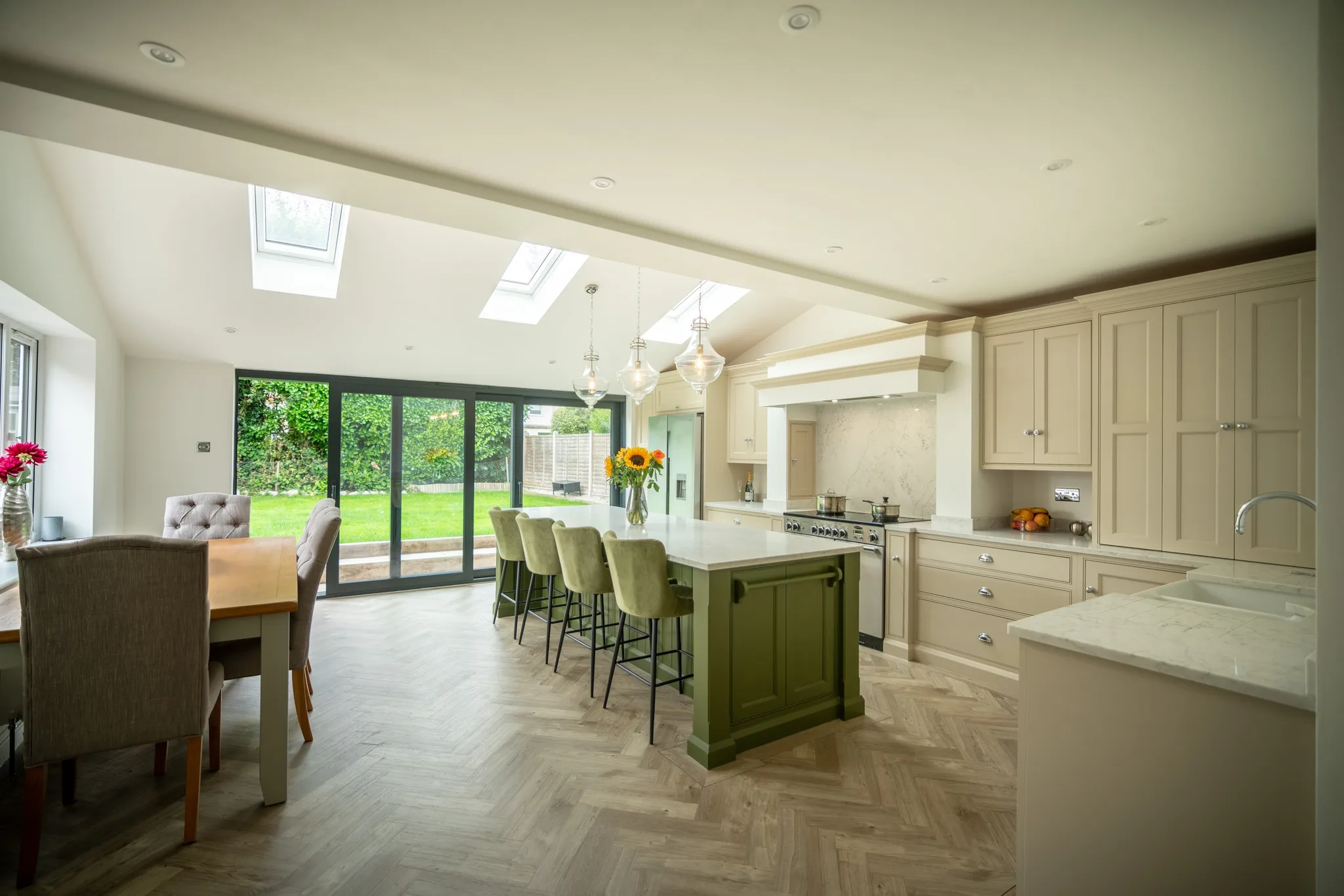
Elsenham, Essex: Olive Colour by Little Greene
The brief for this
project was an olive as the main tone with a greige for the surrounding cabinets. The clients were clear that they did not want the usual blue or grey. A complete transformation happened at the back of the property, where a new
kitchen was built, with the island in the middle in our traditional shaker style, hand-painted in Olive Colour by Little Greene. The island runs to three metres, which gives it room for entertaining and for a serious amount of storage.
Woldingham: Onyx by Benjamin Moore
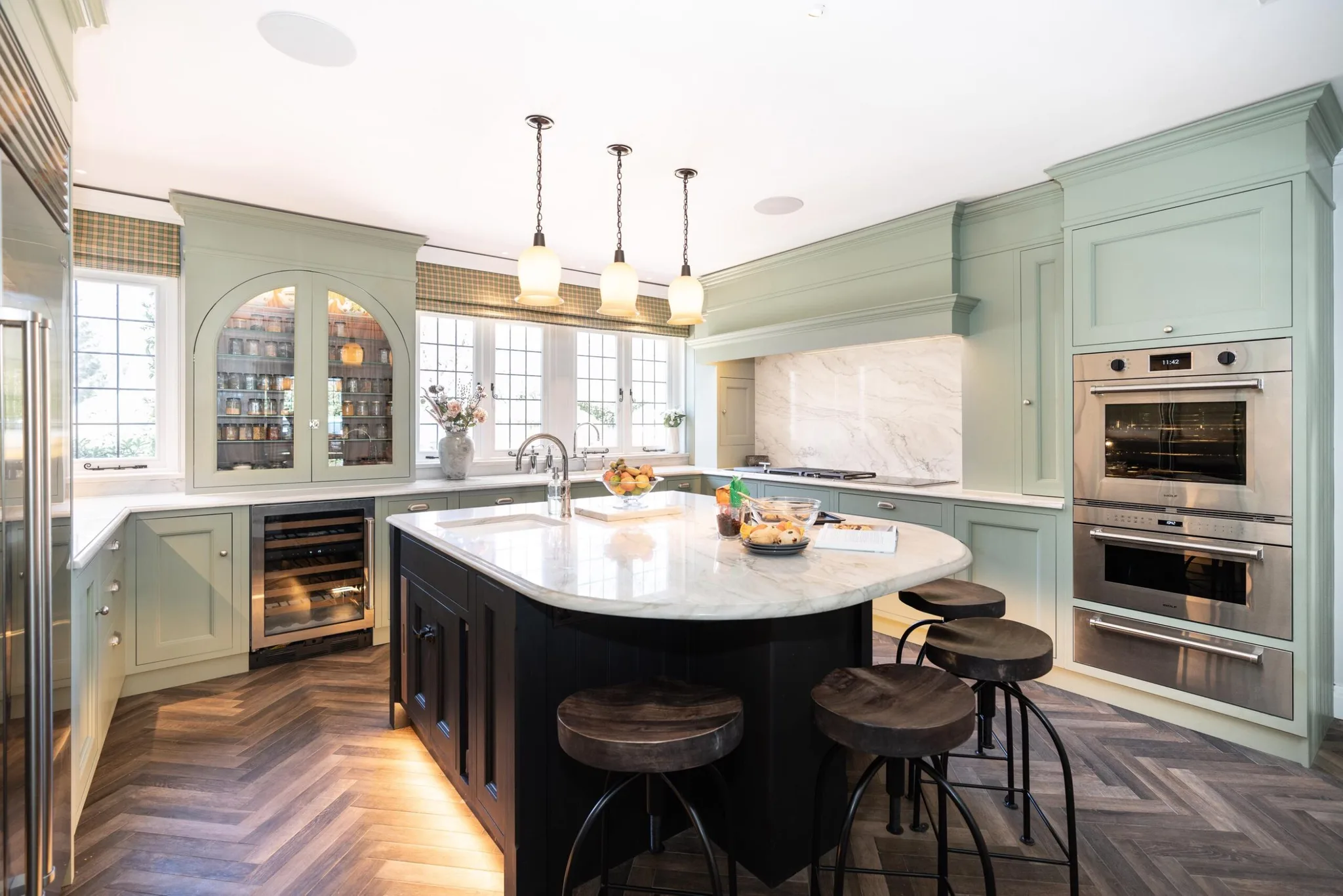
Set among acres of land in a five-bedroom home in
, a traditional shaker island takes centre stage. We hand-painted it in Onyx by Benjamin Moore, a true black with little or no undertone, which makes for a dramatic centrepiece. The island is an unusual shape, topped with Polaris White Quartzite, and holds a second sink, seating along one edge and generous storage.
Stock, Essex: Card Room Green by Farrow & Ball
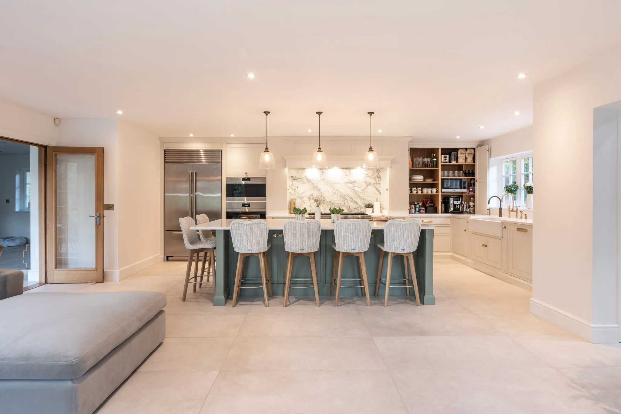
The island in this
kitchen acts as a divider in a grand space, separating the kitchen from the living area. We hand-painted it in Card Room Green by Farrow & Ball, a muted grey-green, set against the lighter Slipper Satin on the surrounding cabinetry. Six seats run around the overhang. The island also takes a wine cooler, a dishwasher, bespoke chopping boards and a good deal of storage.
Bishop's Stortford: Brinjal by Farrow & Ball
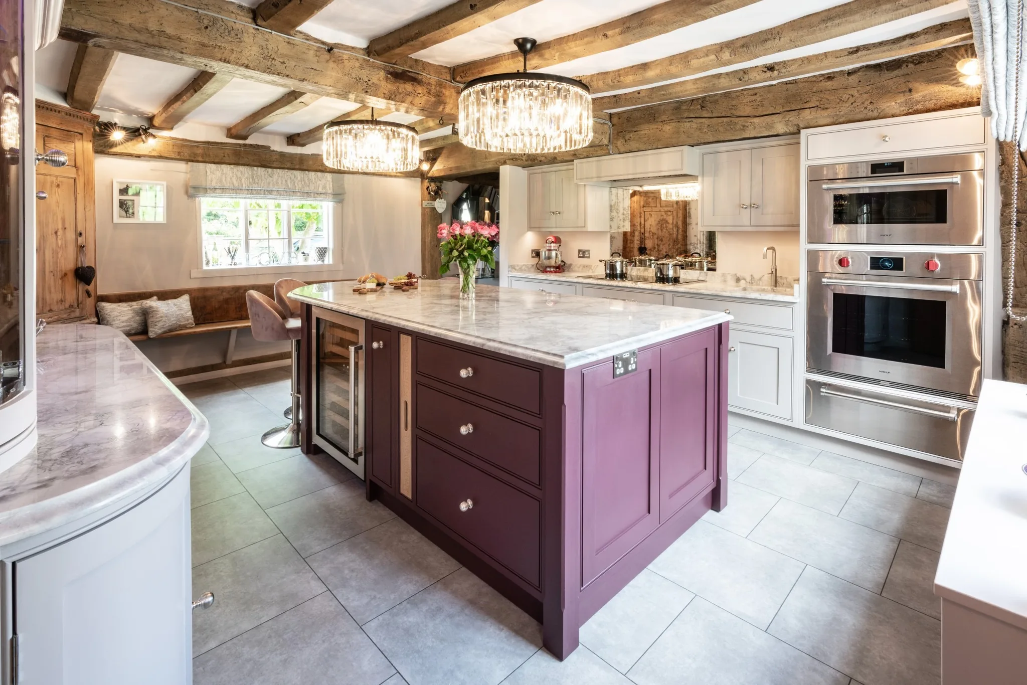
In this
property the island is hand-painted in Brinjal by Farrow & Ball, an aubergine that catches the light. The island houses Sub-Zero undercounter wine storage, which works well beside the adjacent bar area. It curves round on the far side, making a natural spot for a few stools.
Mapesbury, London: Down Pipe by Farrow & Ball
An individual scheme for our clients in
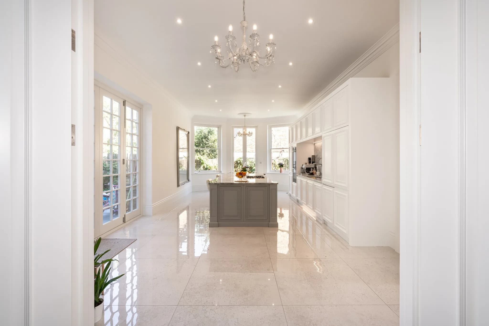
. The idea was a feature wall of furniture with an island in the middle, topped by the largest single piece of Bianca Eclipsia quartzite available. The style mixes traditional mouldings with handleless doors. The island is hand-painted in Down Pipe by Farrow & Ball, a dark grey that carries the luxurious finish of the room.
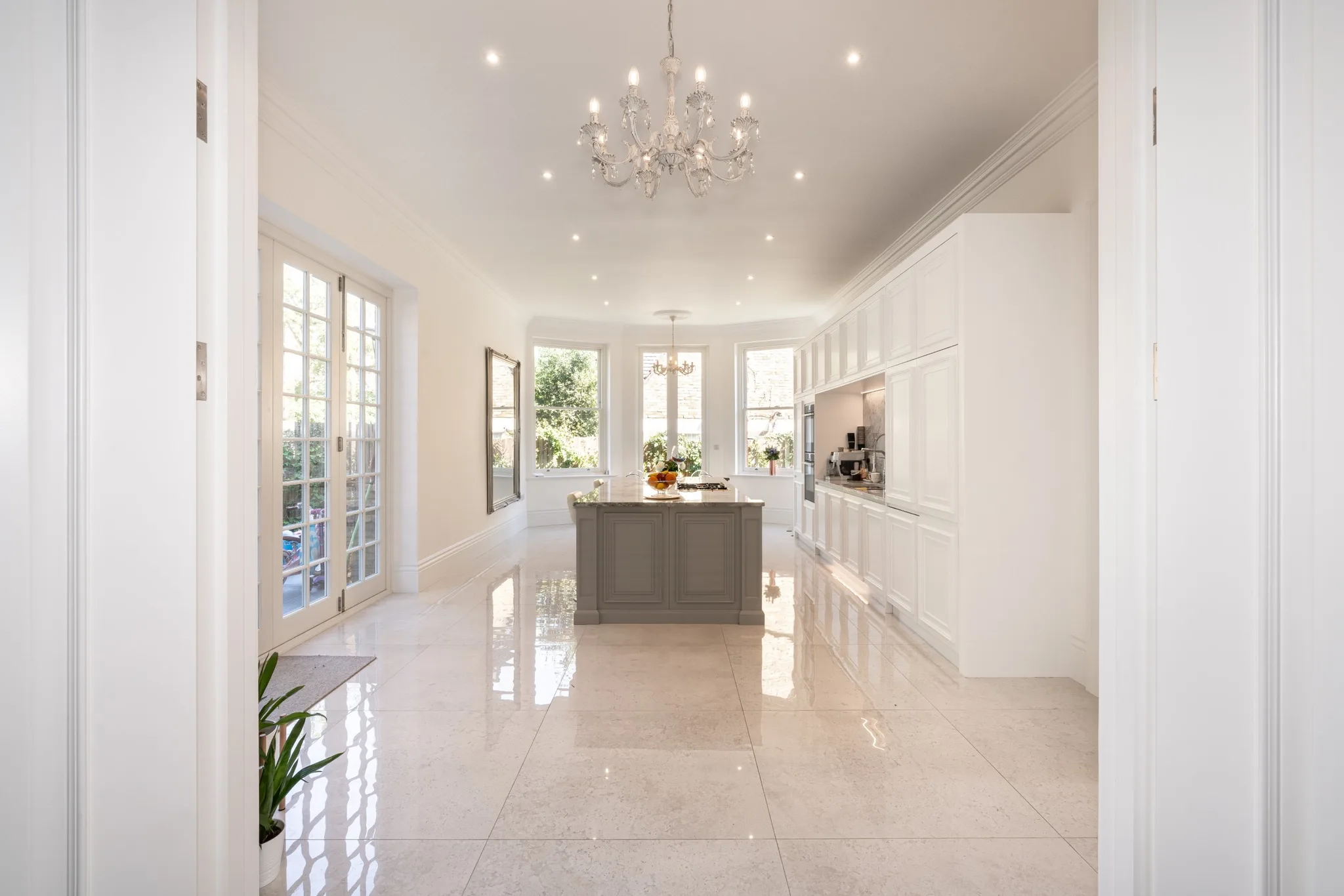
Hatfield Broad Oak: Basalt by Little Greene
This
home opened up its space and ran our classic shaker furniture through it, with the island given a dramatic finish in Basalt by Little Greene, a blue-black. The island was built around an existing wall and holds storage, a wine cooler, extra worktop, a second sink and the induction hob.
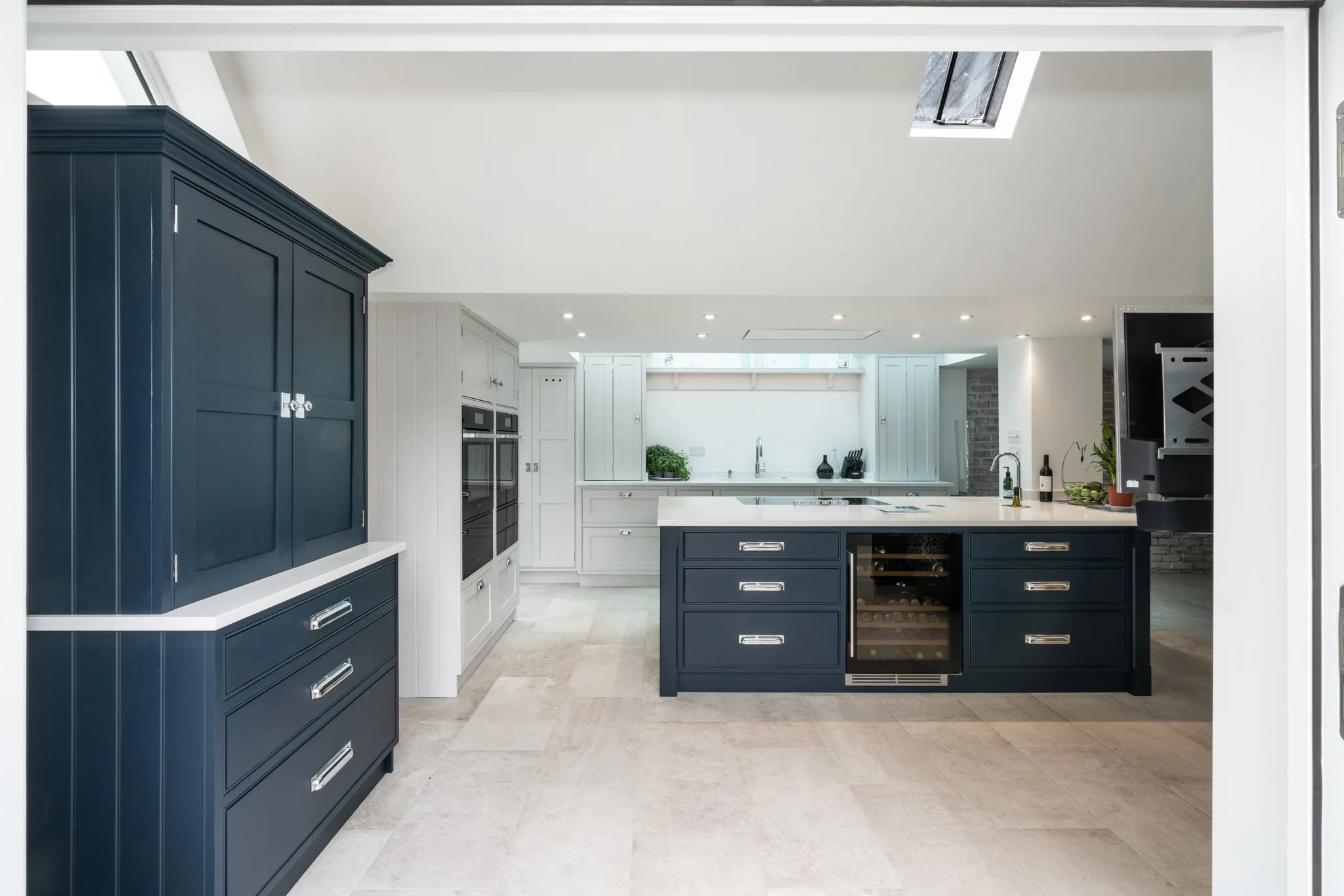
Hadley Wood: Juniper Ash by Little Greene
The large island in this
project has generous storage, seating for six and a secondary sink, hand-painted in Juniper Ash by Little Greene for a calmer, more restful feel than a true black would give.
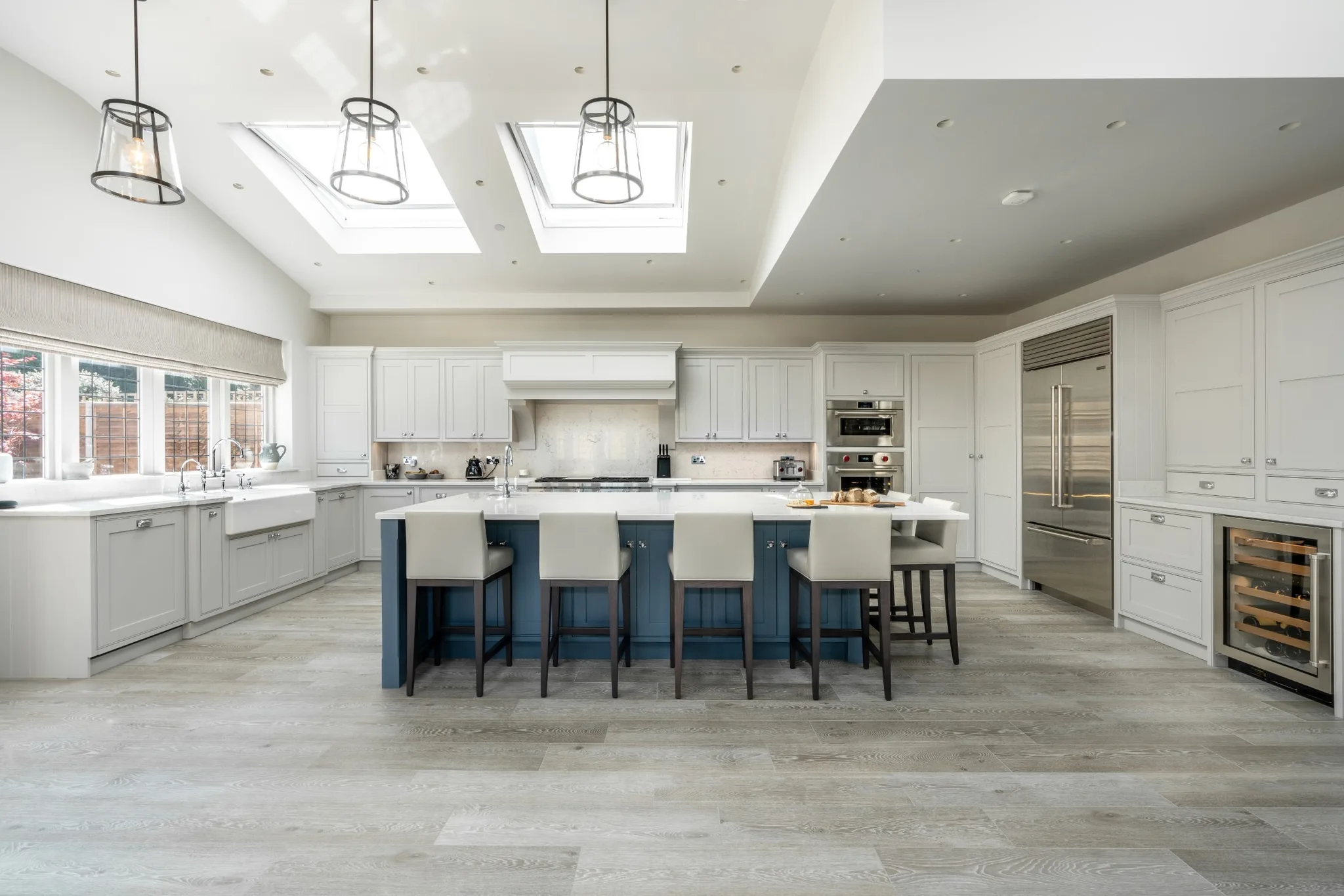
Upminster: Down Pipe by Farrow & Ball
Down Pipe appears again on the island in the
project, where the island divides the room into zones. The wooden elements throughout give it a Scandinavian feel.
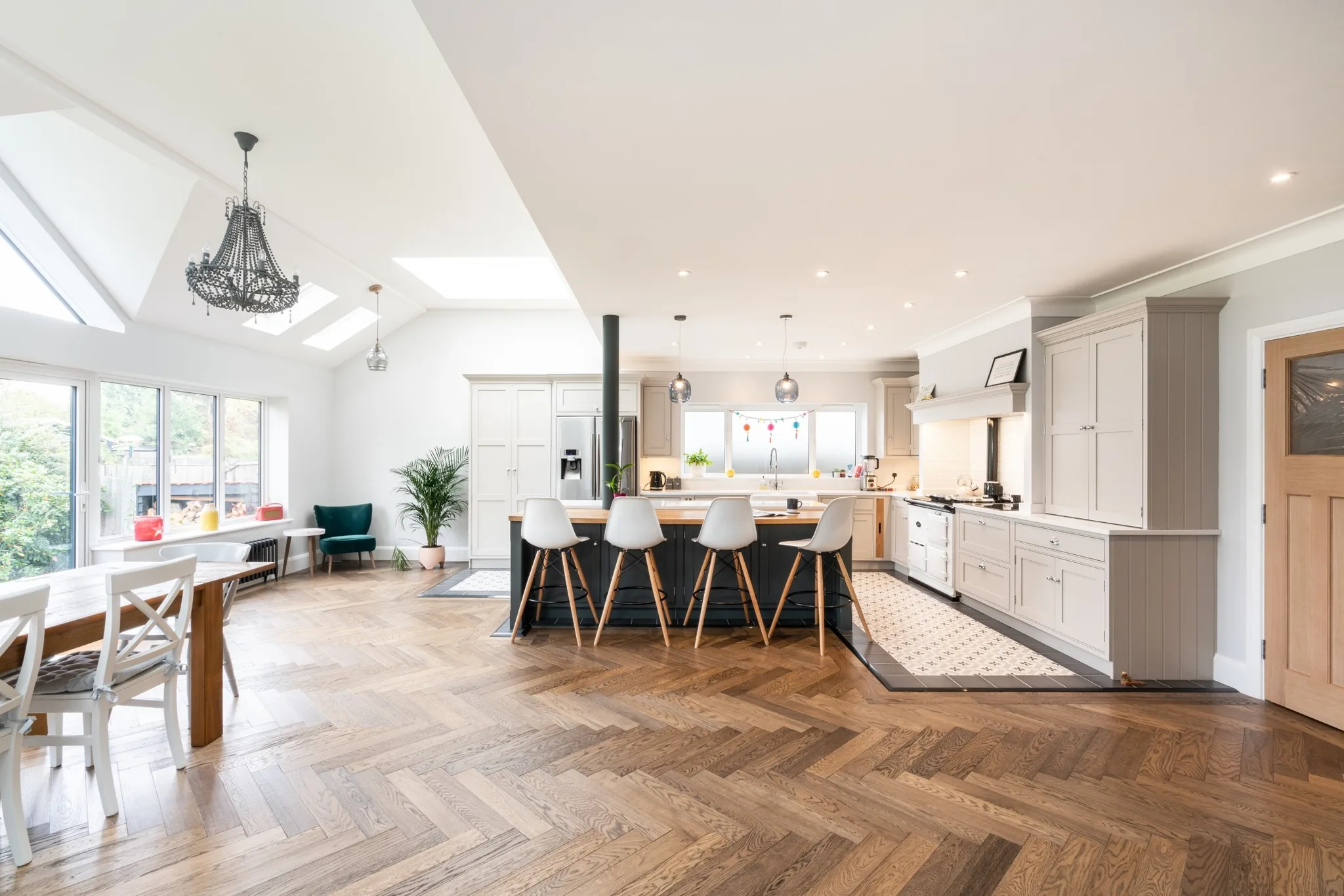
Winchmore Hill: Plummett by Farrow & Ball
This
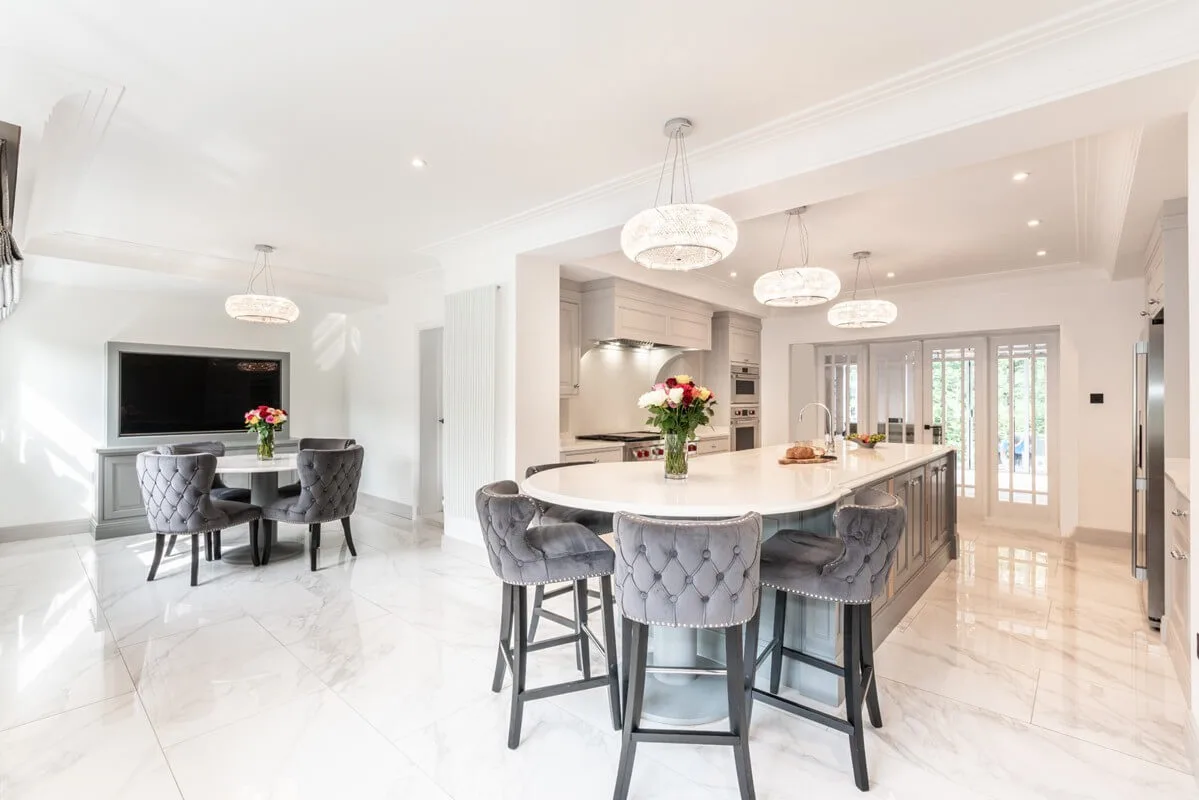
design mixes two styles for character. Velvet bar stools sit around a rounded breakfast bar attached to the main island, which divides the open-plan space and is hand-painted in Plummett by Farrow & Ball, a lighter lead grey with strong architectural character.
Contrasting Kitchen Island FAQs
Should the island be darker or lighter than the rest of the kitchen?
Darker, in most rooms. A darker island advances visually and anchors the middle of the space, while lighter perimeter cabinetry keeps the walls feeling open. The reverse can work in a room with dark walls or a lot of timber, but it is the less forgiving way round.
How many colours should a kitchen use?
Two is the reliable answer: one for the perimeter run and one for the island. A third can work if it is confined to a single separate piece, such as a dresser or a pantry interior. Beyond that a room starts to look assembled rather than designed.
Does a contrasting island work in a small kitchen?
It can, but it has less to do. The effect depends on there being enough perimeter cabinetry for the island to contrast against. In a small room a strong colour on the island can close the space down rather than give it a focal point.
Can you paint an island in any brand of paint?
Yes. We hand-paint on site and are not tied to one manufacturer, so an island can be matched to Farrow & Ball, Little Greene, Paint & Paper Library, Benjamin Moore or anything else you bring us, including a colour matched to something you already own.
Where does Handmade Kitchen Company build kitchen islands?
We design, hand-build and hand-paint bespoke kitchen islands from our workshop in Essex, for clients across Essex, Hertfordshire and North London, and occasionally further afield for the right project. If you would like to know more about our kitchen islands and how one could work in your space,
today. We look forward to hearing from you.